You've found the perfect chair — beautiful linen, clean lines, the right scale. But when it arrives, something feels off. The room doesn't cohere. The chair looks like it was sourced from a different project entirely. Chair pairing mistakes like this are frustratingly common, and they almost always trace back to the same root cause: applying the wrong logic before the purchase.
Chair pairing is not a lookup exercise. The right approach starts with use scenario — dining or accent — then works through the interaction between linen fabric color, texture, and the room's tonal background. Get that sequence right, and the chair integrates. Reverse it, and even a beautiful piece will read as an outlier. This guide walks through the full decision framework, from scenario identification to fabric selection to the options that unlock precision on high-end projects.

Most designers I speak with have already done the visual research. They've built the mood board, pulled the fabric samples, maybe even shortlisted two or three chair silhouettes. Where things break down is the pairing logic itself — the reasoning that connects a specific chair to a specific room in a way that holds up under real lighting, real occupants, and real scrutiny from a client standing in the doorway. The sections below work through that reasoning step by step.
Dining Chairs vs. Accent Chairs: Does the Pairing Logic Really Differ?
In conversations with designers sourcing for high-end US residential projects, one of the most common pairing errors we see is treating dining chairs and accent chairs as the same problem. They aren't. The room context, the performance expectations, and the visual function of each chair type are fundamentally different — and conflating them produces rooms that feel either flat or incoherent.
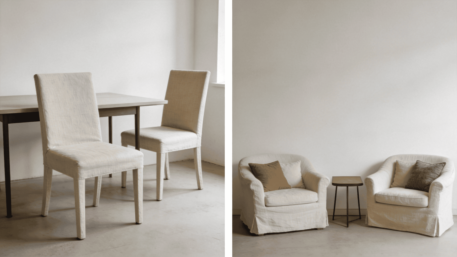
The pairing logic for dining chairs prioritizes tonal cohesion and durability under varied conditions. Accent chairs operate as focal points where a single texture or hue contrast can anchor a corner. Applying accent chair logic to a dining set, or vice versa, is one of the most reliable ways to create a room that doesn't hold together.
Why Dining Chairs Demand a Different Standard
Dining chairs face conditions that accent chairs rarely do. They sit under direct task lighting, they're pulled out and pushed back repeatedly1, and they're seen from multiple angles by multiple people across a range of occasions — a quiet weeknight dinner, a formal holiday table, a Sunday brunch with morning light flooding in from the east.
Under those conditions, tonal consistency matters more than visual interest. A linen dining chair that photographs beautifully on a grey afternoon can look washed out under warm pendant lighting or visually heavy under bright overhead fixtures. The pairing question for dining chairs is not "does this look good?" — it's "does this hold up across every condition this room operates in?"
Key considerations for dining chair pairing:
- Light sources and time of day. Identify the room's dominant light: warm incandescent, cool LED, natural north-facing, or bright south-facing. Linen reads differently under each.
- Table material and finish. A dark walnut table with warm amber tones will pull a cool-toned linen chair into visible tension2. A light oak table creates room for a broader range of fabric undertones.
- Guest-facing scrutiny. Dining chairs are examined up close. Texture, weave consistency, and seam quality are all visible. The fabric choice should reward close inspection, not just distant viewing.
| Table Finish | Recommended Linen Undertone | Undertones to Avoid |
|---|---|---|
| Dark walnut / espresso | Warm naturals, camel, sandstone | Cool greys, icy whites |
| Light oak / white oak | Warm oatmeal, soft sage, flax | Stark whites, very warm terracotta |
| White lacquer / marble | Cool linens, greige, soft stone | Deep browns, heavy warm tones |
| Brass / mixed metal | Warm naturals, earthy mid-tones | Cool pure linens with grey base |
Why Accent Chairs Can Carry More Risk — and Reward
An accent chair in a living room, reading corner, or bedroom functions as a focal point. It doesn't need to recede into the room — it needs to anchor a zone. That means a deliberate contrast in texture, hue, or visual weight is often the right move, whereas the same contrast in a dining set would feel unsettled.
For a designer working on a living room with warm white plaster walls and a natural fiber rug, a single linen accent chair in a muted dusty blue or a deep sage green can do exactly what a room needs: it gives the eye a place to land without competing with the architecture. That same chair at a dining table for eight would dominate rather than anchor.
The accent chair pairing questions are:
- What is the chair's job in this corner? Contrast, complement, or echo?
- What material is the chair adjacent to? Leather sofa, wool throw, stone hearth — each shifts what the linen reads against.
- What's the natural light behavior in this zone? A chair by a west-facing window will shift warmth significantly in the late afternoon.
Does Linen Fabric Color Really Change Under Different Lighting?
Many clients come to us having selected a linen colorway from a flat product image. When the chair arrives, the color reads differently — sometimes slightly, sometimes dramatically. This isn't a quality control issue. It's a physics issue, and understanding it prevents one of the most common and frustrating pairing failures.
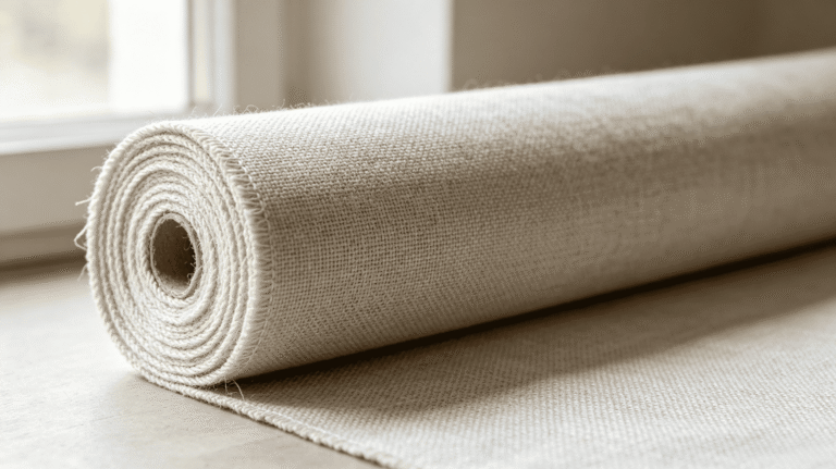
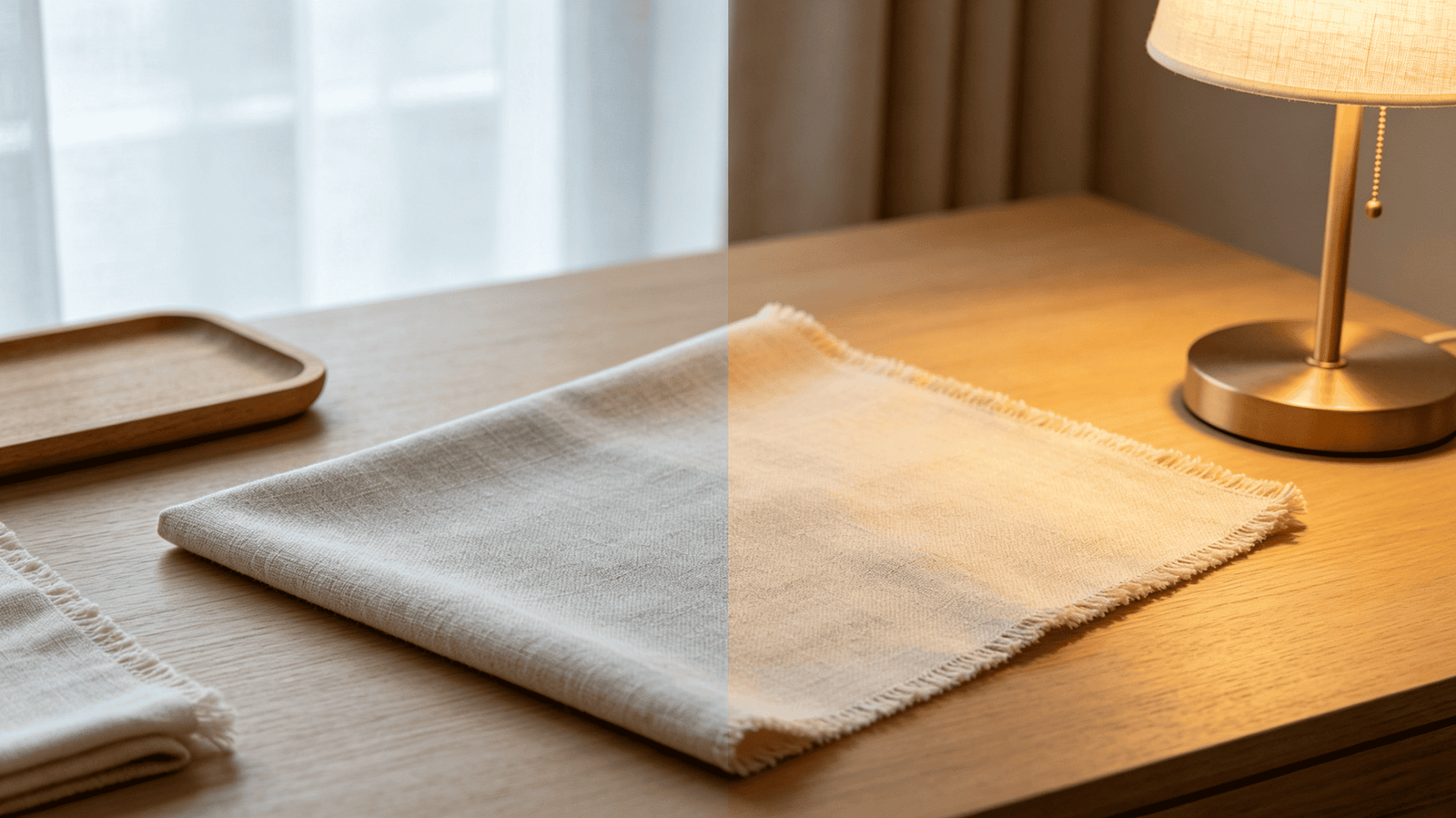
Belgian pure linen reads noticeably differently under warm versus cool light3, and its natural texture adds visual weight that solid-color synthetic fabrics don't carry. The fabric color you select is not a fixed output — it's a variable that shifts with the room's light environment.
Understanding Linen's Natural Color Behavior
Linen fibers have an inherent warm base. Raw and natural-toned linens carry slight yellow or straw undertones4 that activate under warm light and flatten under cool light. Mid-toned earthy linens — dusty rose, sage, clay — behave similarly: warm light deepens and enriches them; cool LED lighting can make the same fabric look greyed-out or flat.
What we see consistently across projects:
- Warm incandescent or amber LED: Natural oatmeal linens glow golden. Cool greige linens shift warmer and read as cohesive with wood tones.
- Cool daylight or blue-biased LED: The same oatmeal linen can read as dull or slightly yellow. Stone-toned or cooler linens perform better here.
- North-facing rooms with diffuse natural light: Neutral linens hold their character well, but very warm shades can look muddy. This is where soft sage, dusty blue, or cool stone linens often outperform "safe" naturals.
- South or west-facing rooms with direct sun: Warm light is intense and shifting. Deeper, richer linens — camel, tobacco, terracotta — tend to hold their presence. Very pale linens can bleach out visually.
Why 200+ Colorways Is a Decision Tool, Not a Catalog
When I tell designers we offer 200+ linen fabric colors in our made-to-order program, the reaction is sometimes overwhelmed rather than relieved. That's because they're thinking of it as a browsing problem rather than a tuning problem.
The value of a broad colorway range is that it allows the chair to be dialed into the room's specific undertone, rather than forcing a compromise between what's available and what's needed. A room with warm-white walls and a cool-toned rug requires a linen that sits precisely between those two pulls — and finding that specific hue in a standard 20-color product line is unlikely.
The correct workflow:
- Identify the room's dominant undertone (warm, cool, or mixed)
- Identify the primary light source and its color temperature5
- Request physical swatches in 3–5 candidate shades from that tonal range
- Evaluate swatches in the actual room, under the actual lighting — not on screen
If no available colorway hits the mark, COM (customer's own material)6 is the precise solution. More on that below.
Is "Neutral" Always the Safe Choice for Linen Chair Pairing?
This is the pairing misconception we see most often, and it causes real, documented failures. Designers and homeowners default to greige, oatmeal, or warm white on the assumption that neutrals match everything. In practice, a neutral linen in the wrong undertone doesn't read as safe — it reads as clashing in a way that's hard to diagnose.
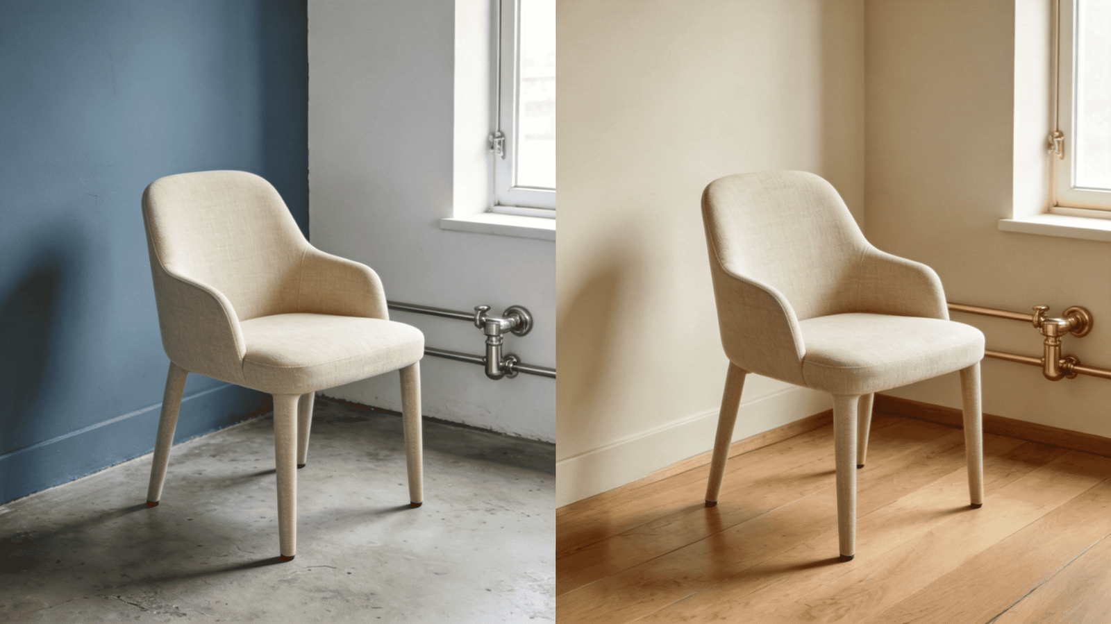
The problem with "neutral = safe" is that it ignores the most important variable: the room's own undertone. A cool-toned room — white walls with a blue-grey base, polished concrete floors, chrome fixtures — will throw a warm oatmeal linen into visible contrast. Not a dramatic contrast, but a subtle, nagging one. The room feels slightly off, and neither the designer nor the client can name why.
The Correct Move: Identify Undertone First
The decision sequence should be:
- Read the room's dominant undertone. Stand in the room with the main light on and identify whether the space reads warm (yellow/amber cast), cool (blue/grey cast), or balanced.
- Identify the undertone of the primary fixed elements. Floors, walls, and ceiling are the frame. Cabinetry and built-ins follow.
- Select linen from the matching tonal family — not just the matching darkness level.
Practical breakdown:
- Warm-toned rooms (honey oak floors, warm white walls, brass hardware): Warm naturals, flax, sandstone, camel. Avoid anything with a visible grey or blue base.
- Cool-toned rooms (white oak, plaster white with grey undertone, chrome or black hardware): Stone, cool greige, dusty blue, pale sage. Avoid warm oatmeal and raw naturals.
- Mixed or balanced rooms (medium walnut, off-white walls, mixed metals): Mid-toned earthy shades — clay, muted sage, driftwood — perform well because they don't resolve strongly to either pole.
What Happens When No Standard Color Is the Right Undertone
This is the dead end that custom capability is designed to solve. If a designer is working on a project where the room's undertone is very specific — say, a coastal home with aged whitewash walls, sea-glass accessories, and bleached linen drapery — and no standard colorway lands precisely, the answer is not to compromise. The answer is COM.
We regularly accept customer's own material for made-to-order chairs. A designer sourcing fabric through their own textile supplier, or specifying a material from a curated architectural collection, can send the fabric to us and have the chair built to their specification. This is not a complex workaround — it's a standard option, and for high-end residential projects, it's often the correct one.
When Does a Made-to-Order or COM Chair Make Sense?
Standard dimensions and available colorways solve most projects. But on high-end residential commissions — particularly in the US, where room scales vary widely and design intent is highly specific — standard options regularly hit a wall.
Made-to-order and COM capabilities are not upsells. They are functional pairing tools that allow the designer to close the gap between what a room requires and what a product line offers.

The Scenarios Where Custom Is the Right Call
Scenario 1: Specific room dimensions. A dining room with a long custom table — say, 140 inches — and low-profile seating requirements may need chairs with a seat height and back height that no standard product matches. Made-to-order construction allows both dimensions and silhouette to be specified.
Scenario 2: Fabric the designer already owns or is specifying. An interior designer working across multiple rooms in a single residence may be running a specific textile throughout — a particular Belgian linen, a woven indoor-outdoor fabric, a high-performance weave for a client with children. COM allows the chair to be built in the project fabric, maintaining material continuity across the residence.
Scenario 3: Color precision that no standard colorway delivers. As discussed above, when a room's undertone is highly specific and standard colors don't land, COM is the clean solution.
Scenario 4: Volume projects requiring consistency. A designer furnishing a large home with eight dining chairs and four accent chairs in the same fabric wants production consistency — matched dye lots, uniform stitching, and coordinated lead times. A made-to-order program handles this in ways a standard in-stock product cannot.
The lead time for made-to-order linen chairs is a legitimate planning variable. Designers sourcing for large projects should build this into the project schedule, not treat it as a late-stage option.
Frequently Asked Questions
How do I know which linen undertone is right for my room?
Start by identifying your room's dominant undertone from its fixed elements: walls, floors, and ceiling. If those read warm (amber, honey, golden), choose linen from a warm natural family. If they read cool (grey, blue-white, stone), select cooler linens. Evaluate physical swatches in the actual room under real lighting before confirming.
Can I send my own fabric for a custom linen chair order?
Yes. We regularly accept COM (customer's own material) for made-to-order chairs. If you're working with a specific textile that needs to run across multiple pieces in a project, or if no available colorway matches your room's requirements, COM is the correct path. Contact us to discuss fabric specs and yardage requirements before ordering.
Is Belgian linen suitable for dining chairs in a family home?
Belgian pure linen7 performs well in dining environments, but performance depends on weave weight and finishing. Heavier weave linens with a tight construction wear significantly better than loose or lightweight weaves8. We recommend discussing intended use with us before selecting a fabric — some colorways are available in multiple weave weights.
How do dining chair and accent chair pairing rules differ?
Dining chairs prioritize tonal cohesion across varied lighting conditions and should integrate without drawing undue attention. Accent chairs can carry deliberate texture or hue contrast as part of their function. Applying accent chair logic to a dining set produces visual competition; applying dining chair logic to an accent chair produces flatness.
What is the typical lead time for made-to-order linen chairs?
Lead times vary by order volume and whether COM fabric is involved. Standard made-to-order production at our Foshan facility typically runs several weeks from confirmed specification. For large projects, we recommend early engagement to align production scheduling with your installation timeline.
Conclusion
Chair pairing done well is a sequence of decisions, not a single judgment call. Start with use scenario — dining or accent — because the pairing logic is genuinely different. Then identify the room's undertone and light behavior before selecting any linen colorway. Treat "neutral" as a category with undertone variables, not a universal solution. And when standard dimensions or available colors don't meet the project's requirements, know that made-to-order and COM options exist to close that gap precisely.
The framework above reflects what we've observed across years of working with US and European designers on high-end residential projects. If you're at the point where a chair is shortlisted and the pairing question is real, we're glad to work through it with you — whether that starts with a swatch request, a fabric consultation, or a conversation about custom specifications.
"Comparative study on design and functionality requirements for ...", https://bioresources.cnr.ncsu.edu/resources/comparative-study-on-design-and-functionality-requirements-for-senior-friendly-furniture-for-sitting/. Industry durability standards, including those published by BIFMA International (Business and Institutional Furniture Manufacturers Association) and ANSI, establish differentiated testing protocols for seating categories based on anticipated use frequency; dining and task chairs are typically tested to higher cycle counts for drop, leg load, and back durability than occasional seating, reflecting their greater frequency of use in residential and commercial environments. Evidence role: general_support; source type: institution. Supports: Furniture durability standards distinguish between seating categories based on expected use frequency, with dining and task seating subject to higher cycle testing requirements than occasional or accent seating. Scope note: BIFMA standards are primarily developed for commercial contract furniture; residential dining chair standards may vary by manufacturer and market ↩
"The Science Behind Color Perception: Simultaneous Contrast and ...", https://vdci.edu/learn/interior-design/science-color-perception. The principle of simultaneous color contrast, described extensively in color perception literature following Chevreul's foundational work, holds that juxtaposed surfaces with opposing warm and cool chromatic biases mutually exaggerate their apparent difference; this effect is relevant to interior material pairings where upholstery and furniture finishes occupy adjacent visual fields. Evidence role: mechanism; source type: research. Supports: Simultaneous color contrast, a well-documented perceptual phenomenon, causes adjacent surfaces with opposing warm and cool undertones to mutually intensify their apparent difference, producing visual tension. Scope note: Experimental studies on simultaneous contrast typically use controlled chromatic stimuli rather than complex textured surfaces such as linen upholstery and wood grain ↩
"Light and Color - Oklahoma State University Extension", https://extension.okstate.edu/fact-sheets/light-and-color. Research on textile spectrophotometry demonstrates that natural cellulosic fibers reflect light non-uniformly across the visible spectrum, producing measurable shifts in perceived color when illuminated by sources of differing correlated color temperature (CCT); this effect is more pronounced in undyed or lightly dyed natural linens than in synthetic alternatives. Evidence role: mechanism; source type: research. Supports: Natural cellulosic fibers such as linen exhibit differential spectral reflectance under light sources of varying color temperature, causing perceived color shifts. Scope note: Most textile color research focuses on dyed fabrics and standardized illuminants rather than interior lighting scenarios specifically ↩
"Effect of Nitrogen on the Properties of Flax (Linum usitatissimum L ...", https://pmc.ncbi.nlm.nih.gov/articles/PMC8839529/. Linen, produced from the bast fibers of the flax plant (Linum usitatissimum), retains trace quantities of natural waxes, pectins, and lignan compounds after retting and scutching; these residual constituents contribute to the fiber's characteristic warm, straw-like natural color prior to bleaching or dyeing. Evidence role: definition; source type: encyclopedia. Supports: Linen fibers derived from flax (Linum usitatissimum) contain natural waxes, pectins, and lignan compounds that impart a characteristic warm, yellowish or straw-colored appearance in undyed or minimally processed states. Scope note: The precise contribution of each compound to perceived color varies with processing method and fiber origin, and may not be consistent across all Belgian linen grades ↩
"Color temperature - Wikipedia", https://en.wikipedia.org/wiki/Color_temperature. Color temperature, expressed in Kelvin (K), describes the spectral emission of a light source by reference to the radiation of a theoretical blackbody radiator at a given temperature; in practical interior lighting, sources below approximately 3000 K are perceived as warm (amber to yellow-white), while sources above 5000 K are perceived as cool (blue-white), with significant consequences for the perceived color of illuminated surfaces including textiles. Evidence role: definition; source type: encyclopedia. Supports: Color temperature, measured in Kelvin, is a standardized metric describing the spectral character of a light source, with lower values indicating warmer (amber/yellow) light and higher values indicating cooler (blue/white) light. Scope note: Perceived color temperature in a room is also influenced by surface reflectances, room geometry, and the presence of multiple light sources, making single-source CCT values an incomplete predictor of visual outcome ↩
"[PDF] SECTION 12 50 00: FURNITURE", https://cpfm.uoregon.edu/sites/default/files/12_50_00_-_furniture_082719.pdf. COM, or customer's own material, is an established trade practice in the contract and residential furniture industries, recognized by professional organizations including the American Society of Interior Designers (ASID) and the International Interior Design Association (IIDA); it allows specifying designers to maintain material continuity across a project by supplying fabric directly to the manufacturer, subject to yardage and technical specifications set by the fabricator. Evidence role: definition; source type: institution. Supports: COM (customer's own material) is a recognized trade practice in the furniture and interior design industry whereby a client or designer supplies fabric directly to a manufacturer for use in upholstering a specified piece. Scope note: COM practices and requirements vary by manufacturer, and the term is used primarily in North American trade contexts ↩
"Belgian Linen - Wikipedia", https://en.wikipedia.org/wiki/Belgian_Linen. Belgium has been a center of linen production since the medieval period, with the Flanders region historically recognized for high-quality flax cultivation and wet-spinning techniques; industry bodies such as the Masters of Linen certification program have formalized quality and traceability standards for European linen, distinguishing it from lower-cost linen produced in other regions. Evidence role: definition; source type: institution. Supports: Belgian linen refers to linen produced from flax grown and processed in Belgium and neighboring regions of Western Europe, historically associated with specific retting, spinning, and weaving traditions that produce a fine, consistent fiber. Scope note: The term 'Belgian linen' is used commercially with varying precision and does not always correspond to a formally certified standard ↩
"Quantitative Assessment of Woven Fabric Surface Changes During ...", https://pmc.ncbi.nlm.nih.gov/articles/PMC12348827/. Standardized upholstery fabric testing, including the Martindale abrasion test (ISO 12947) and the Wyzenbeek method (ASTM D4157), consistently demonstrates that fabrics with higher thread counts and tighter weave constructions achieve greater rub-cycle ratings before surface degradation; this relationship between weave density and wear resistance is well-established in textile engineering literature. Evidence role: mechanism; source type: research. Supports: Upholstery fabric durability is measurably related to weave density and yarn count, with tighter constructions demonstrating higher abrasion resistance in standardized testing such as the Martindale rub test. Scope note: Published test data for linen-specific upholstery fabrics is less extensive than for synthetic or blended upholstery textiles, and real-world performance also depends on finishing treatments ↩