Occasional chairs are easy to get wrong. Designers often treat them as a flexible finishing touch — something to drop into a corner once the primary furniture plan is settled. That approach produces rooms where the chair technically fits but never quite works. The result: a client who can't explain why the space feels incomplete, and a designer who has to revisit a decision that should have been locked in at the planning stage.
An occasional chair earns its place in a high-end residence only when you evaluate it against three concrete variables before you order: spatial function, light behavior, and material logic. Get those three right, and the chair anchors the room. Skip them, and even a beautifully made piece reads as an afterthought. This guide walks through each variable in sequence — with specific conditions, real consultation patterns, and a framework you can apply directly to your next residential project.
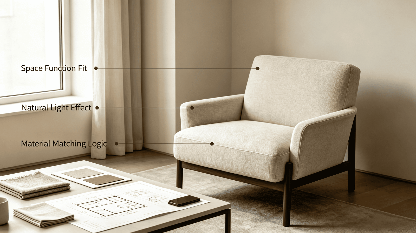
The three-variable framework sounds straightforward. In practice, most specification errors happen because designers address all three simultaneously — treating scale, fabric, and placement as one aesthetic judgment rather than three sequential decisions. The sections below separate them deliberately.
What Is the Occasional Chair Actually Doing in This Room?
Most furniture mistakes start with aesthetics before function. An occasional chair placed without a clear spatial role creates visual weight without purpose — and in high-end residential work, that reads immediately to experienced clients.
Before evaluating any chair for a project, define its primary spatial function. That function determines scale, seat height, silhouette, and — critically — where fabric weight and texture need to perform. Function is not a secondary concern. It is the first specification constraint.
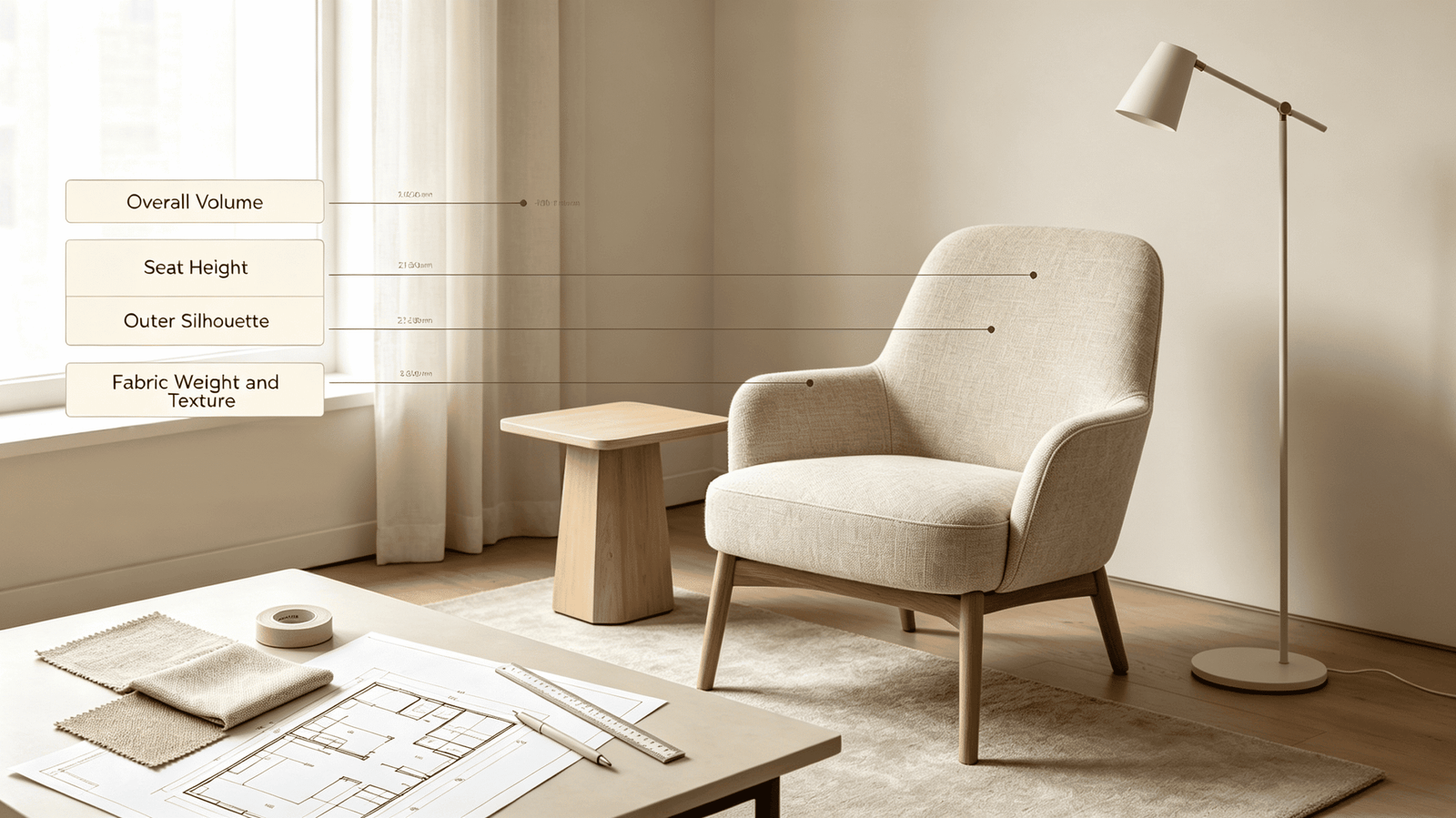
The Three Primary Functions an Occasional Chair Serves
In our experience processing orders for high-end U.S. and European residential projects, occasional chairs consistently appear in one of three roles. Each role sets different hard constraints.
1. Reading or Activity Corner
This is the most common application. A single chair — often with a side table and floor lamp — creates a defined retreat within a larger open-plan space or bedroom. The functional requirements here are specific:
- Seat depth of 22–26 inches to support extended sitting1
- Back height sufficient to provide neck or head support (38–42 inches total frame height for most adults)2
- Low visual bulk to avoid closing off the corner spatially
- Fabric tactility matters here more than in any other placement — the person is within arm's reach of the upholstery for extended periods
A California-based designer specifying chairs for a 6,000 sq ft Newport Beach residence asked us specifically for a deep-seat linen armchair with a loose cushion back for exactly this use case. The loose cushion was not a style preference — it was a functional requirement for extended reading comfort.
2. Entry or Focal Accent
A chair placed in an entry hall, at the end of a corridor, or against a feature wall serves a different function entirely. It is not primarily for sitting. It is a spatial anchor — it gives the eye a destination and signals scale in a transitional space. Requirements shift accordingly:
- Higher visual impact silhouette (taller back, more defined arms)
- Less emphasis on seat depth and comfort ergonomics
- Fabric choice must account for low traffic but high visual scrutiny — guests will look at it more than sit on it
- Color and texture should frame the entry without competing with the primary furniture beyond
3. Conversational Counterweight
In living rooms with a dominant sofa run, a pair of occasional chairs positioned opposite creates balance and supports multi-person conversation. This placement requires:
- Seat height within 1–2 inches of the sofa seat height (typically 17–19 inches) to maintain eye-level parity in conversation3
- Scale calibrated to the sofa mass — a small accent chair across from an 8-foot sectional creates visual imbalance
- Fabric should relate to the sofa but not match exactly — adjacent materials should differ in texture or tone to prevent the arrangement from reading as a matched set
| Function | Seat Depth | Back Height | Fabric Priority | Key Constraint |
|---|---|---|---|---|
| Reading corner | 22–26 in | 38–42 in | Tactility | Extended contact comfort |
| Entry focal accent | 20–22 in | 40–46 in | Visual weight | Low traffic, high scrutiny |
| Conversational pair | 20–24 in | 34–38 in | Tonal relationship to sofa | Seat height parity |
How Does Natural Light Change the Occasional Chair Specification?
Light is a material specification, not a styling consideration. Designers who evaluate fabric swatches under office lighting — or even under controlled showroom conditions — routinely misjudge how upholstery will read in situ. For an occasional chair, which is often placed near a window or in a light-receiving corner, this misjudgment can be significant.
The issue is not simply that colors look different under different light sources. The more consequential problem is that fabric texture and visual weight shift dramatically with light direction and volume4 — and these shifts affect how the chair reads in the room at different times of day.
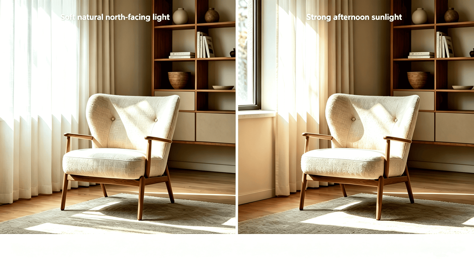
How Linen Behaves Across Different Light Conditions
Linen has a matte, open-weave surface that absorbs and diffuses light rather than reflecting it5. This behavior makes it highly sensitive to light volume and direction — more so than tightly woven synthetics or smooth performance fabrics.
North-facing rooms and skylights: In rooms with indirect northern light or diffused skylight, linen reads as calm and tonally consistent throughout the day. The matte surface doesn't catch harsh angles. A natural or oatmeal linen will hold its tone from morning to late afternoon. This is one of the specific conditions where linen performs particularly well — the fabric's texture becomes visible without becoming dominant.
South-facing rooms with floor-to-ceiling glass: High light volume from south exposure creates a different dynamic. In the morning and early afternoon, direct sunlight can flatten linen's texture and shift neutral tones toward warm yellow. By late afternoon, the same chair may read cooler. Designers specifying linen for high-sun-exposure settings should:
- Review samples in the actual space, at multiple times of day if possible
- Consider cooler linen colorways (stone, slate, dusty blue-grey) that hold their tone across a wider light range
- Be cautious with very light naturals (off-white, undyed linen) in rooms with high UV exposure — these can yellow faster than mid-tone selections6
Artificial light considerations: Warm incandescent or warm LED sources shift linen neutrals toward amber. Cool daylight-spectrum LEDs (4000K–5000K) tend to render linen tones most accurately7. This matters in rooms where the chair is primarily used in the evening.
What This Means for the Specification Decision
The practical takeaway is not complicated: evaluate your linen swatch in the actual room, under the dominant light condition for the primary use time. A reading chair used primarily in the evening should be evaluated under the room's artificial lighting. An entry chair evaluated under north morning light may look entirely different under afternoon west sun.
In our production experience, clients who request fabric memo samples and then evaluate them in the project space make significantly fewer fabric change requests after delivery8. The additional time in the sampling phase prevents specification errors that are expensive and logistically difficult to resolve post-production.
When Is Linen the Right Material for an Occasional Chair?
Linen is not universally appropriate. It is the right choice under specific conditions — and naming those conditions clearly is more useful than positioning it as a premium default.
The honest case for linen is this: it is the preferred material when the brief calls for tactile warmth, visual calm, and a handcrafted quality that performance fabrics and velvets cannot replicate. The wrong brief for linen is a high-traffic household with young children, a client who prioritizes stain resistance above all else, or a design scheme built around high-gloss, high-contrast surfaces.
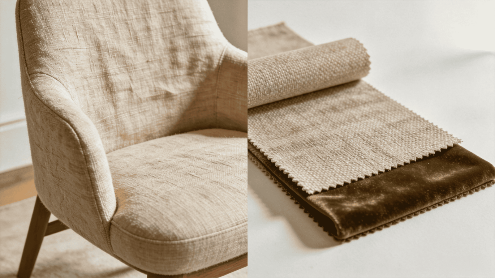
The Specific Conditions Where Linen Outperforms Alternatives
Condition 1: High natural light volume As noted above, linen's matte light-absorption is a concrete performance advantage in light-filled spaces. Synthetic performance fabrics often reflect light in ways that read as flat or plasticky in daylight-rich rooms9. Velvet can appear over-saturated10. Linen holds a natural, visually restful presence under high natural light — this is the single most common reason our designer clients specify it for coastal and mountain-view residences.
Condition 2: The client brief emphasizes sensory and tactile experience High-net-worth clients in the segment our designers serve often have a defined lifestyle orientation — natural materials, minimal synthetic content, artisan quality. For these clients, the tactile hand of linen (the slight texture, the natural variation, the weight of the fabric) is part of the specification requirement, not a secondary preference. A performance weave technically delivers on durability but fails the brief in a way that matters to the client.
Condition 3: The design scheme calls for visual restraint Linen does not compete for attention. In rooms where the architectural features, art, or views are the primary experience, upholstery that recedes is an asset. Linen's natural palette and matte finish support this without requiring the designer to sacrifice material quality.
Condition 4: The chair will not face high daily-use stress For occasional chairs specifically — as opposed to primary sofas or dining chairs — use intensity is lower. An occasional chair in a reading corner or entry hall is not the family sofa. The durability trade-off inherent in natural fiber upholstery matters less when contact frequency is lower.
Where Linen Is Not the Right Call
- Households with pets that shed heavily (linen picks up fine animal hair and is harder to lint-roll than smooth weaves11)
- Poolside or sunroom applications where moisture exposure is frequent
- Projects where the client has explicitly requested maximum stain resistance — linen can be treated, but it is not the first-line choice for this requirement
- Design schemes with a high-gloss, lacquer-heavy, or maximalist material language where linen's quietness reads as underscaled
How Do You Specify Custom Linen Occasional Chairs for a Project?
For project designers working on made-to-order furniture, the ability to specify exact colorways, submit COM fabric, and rely on consistent re-order fulfillment is not a premium service. It is a professional prerequisite. The question is not whether customization is available — it is whether the production partner can execute it reliably within your project timeline and to your specification precision.
The practical specification variables for a custom occasional chair order are:
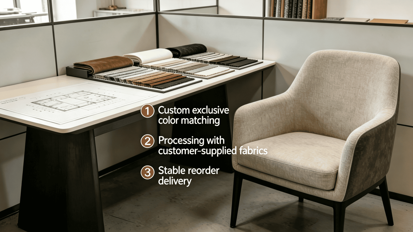
The Variables That Affect Custom Order Planning
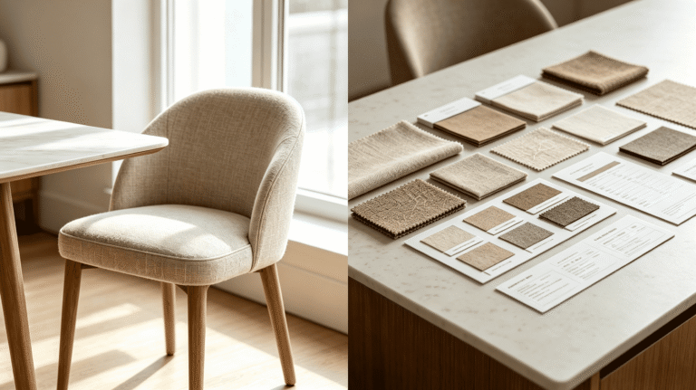
Colorway selection and matching: Working from a palette of 200+ linen colorways allows most designers to align the chair directly to an existing scheme without color compromise. The more useful professional practice, in our experience, is to request memo samples of 3–5 candidate colors and evaluate them against existing floor, wall, and primary furniture finishes in the project space — not in isolation.
For schemes where an existing textile is the reference (a drapery linen, a rug pile color, a wallcovering tone), COM fabric submission allows the designer to use the exact material without color-matching approximation. This eliminates a common source of client sign-off friction.
Lead time as a planning condition: Custom made-to-order production has a defined lead time. For project designers, the practical requirement is to treat the chair order as a long-lead item, placed at the point of client fabric approval — not after final FF&E installation decisions. Orders initiated with sufficient lead time allow for sampling, revision if needed, and shipping buffer without compromising the project schedule.
Re-order consistency: For projects specifying multiple chairs across a large residence, or for designers who return to the same specification across multiple projects, fabric and construction consistency across production runs matters. This is a direct conversation to have with any production partner before committing to a specification.
A practical specification checklist:
- Define the chair's spatial function before selecting silhouette or scale
- Confirm seat height relative to adjacent furniture
- Evaluate linen colorway samples in the project space under dominant light conditions
- Determine COM or catalog fabric path at the point of client presentation
- Initiate production order at fabric approval — not at final delivery coordination
- Confirm re-order run consistency with the manufacturer if multiple units are required
Frequently Asked Questions
How do I determine the right scale for an occasional chair in a large open-plan space?
Start with the chair's spatial function, not its aesthetic. For a conversational pair flanking a sofa, align seat height to the sofa and scale overall frame mass proportionally. For a reading corner in a large room, a slightly larger-scale chair anchors the zone better than a delicate accent piece, which can read as lost in the space12.
Is linen upholstery practical for occasional chairs in high-traffic homes?
Occasional chairs typically face lower use intensity than primary seating — which makes linen more viable here than on a family sofa. In households with pets or young children, a treated or mid-weight linen can perform adequately, but I would recommend discussing specific use conditions with the manufacturer and setting realistic client expectations around care requirements.
Can I submit COM fabric for a custom occasional chair order?
Yes — for designers who have a specific textile already in the scheme, COM submission allows exact material alignment without color approximation. Confirm fabric weight, content, and structural requirements with the manufacturer before submitting, as not all textiles perform well as upholstery in structural applications.
How many linen colorway samples should I request before specifying?
In our experience, requesting 3–5 candidate colors and evaluating them in the project space under the dominant light condition catches most specification errors before production. Evaluating a single confirmed swatch without comparing against room conditions is the most common path to a post-delivery fabric regret.
What is the typical lead time for a custom made-to-order linen occasional chair?
Lead times vary by production partner and order volume. The critical planning principle is to treat made-to-order chairs as long-lead items and initiate the order at the point of client fabric approval — not at the end of the FF&E schedule. Building in shipping buffer time is also essential for international production.
Conclusion
An occasional chair is a spatial decision before it is a design decision. The framework in this guide — define the chair's function, evaluate material behavior under the room's actual light conditions, and apply material logic rather than style preference — gives you a repeatable process for every residential project. Occasional chair styling done well means the chair earns its position in the room rather than filling it. Get the function right, read the light correctly, and choose linen when the brief genuinely calls for tactile warmth and visual restraint — not by default.
If you are specifying occasional chairs for a current high-end residential project and need to evaluate custom linen options — including colorway samples, COM consultation, or made-to-order production — contact the Linen World team directly. We work with U.S. and European designers on project-specific briefs, with 200+ linen colorways, COM acceptance, and consistent re-order fulfillment. Reaching out early in your specification process gives you the sampling time to get the fabric decision right.
"[PDF] Ergonomics and Design A Reference Guide", https://ehs.oregonstate.edu/sites/ehs.oregonstate.edu/files/pdf/ergo/ergonomicsanddesignreferenceguidewhitepaper.pdf. Ergonomic guidelines for seating typically recommend seat depths of approximately 15–19 inches for task seating, with deeper dimensions appropriate for lounge and residential contexts; specific ranges vary by population anthropometrics and intended use duration. Evidence role: definition; source type: research. Supports: Recommended seat depth ranges for comfortable extended sitting based on anthropometric and ergonomic research. Scope note: Most published ergonomic seat depth standards address office or task seating rather than residential lounge chairs specifically, so direct application requires contextual adjustment. ↩
"[PDF] Anthropometric Detailed Data Tables", https://multisite.eos.ncsu.edu/www-ergocenter-ncsu-edu/wp-content/uploads/sites/18/2016/06/Anthropometric-Detailed-Data-Tables.pdf. Anthropometric surveys of the U.S. adult population, such as those conducted by the CDC or military anthropometric databases, document seated eye height and shoulder height distributions that inform whether a given chair back height reaches the neck or head for a representative adult. Evidence role: statistic; source type: government. Supports: Average adult body dimensions that would determine whether a 38–42 inch chair frame height provides head or neck support for most of the adult population. Scope note: Published anthropometric data describes population distributions rather than prescribing furniture dimensions directly; the translation to a specific chair height range requires additional ergonomic assumptions. ↩
"How to Choose the Right Sofa Seat Depth and Height for Your Body", https://chitaliving.com/blogs/blog/sofa-seat-depth-height?srsltid=AfmBOoojiXr8yv-kTvgUL6zpJtf3XkIgHmKOi_Yb3TT2vMjp2EMLvpct. Interior design and furniture ergonomics literature commonly cites residential sofa seat heights in the range of 17–19 inches from floor to seat surface, with consistent seat heights across a conversational grouping recommended to avoid postural asymmetry between occupants. Evidence role: definition; source type: education. Supports: Standard seat height ranges for residential sofas and the ergonomic rationale for matching seat heights in conversational groupings. Scope note: Seat height conventions vary by furniture style and manufacturer, and the specific claim about eye-level parity in conversation is a practical design heuristic rather than a finding from controlled human factors research. ↩
"Color appearance shifts depending on surface roughness ... - PMC", https://pmc.ncbi.nlm.nih.gov/articles/PMC8789860/. Research in surface appearance and visual perception demonstrates that the angle and intensity of incident light substantially affect the perceived texture, depth, and tonal value of woven textile surfaces, with oblique lighting enhancing texture visibility and diffuse lighting reducing it. Evidence role: mechanism; source type: research. Supports: The optical mechanism by which light direction and intensity alter the perceived texture and visual weight of woven fabric surfaces. Scope note: Most formal research on this mechanism is conducted in controlled laboratory settings; direct studies on residential upholstery fabrics under naturalistic lighting conditions are limited. ↩
"Matte surfaces with broadband transparency enabled by highly ...", https://pmc.ncbi.nlm.nih.gov/articles/PMC10942103/. Textile science literature characterizes linen (woven from flax fibers) as having a relatively low surface luster due to the irregular cross-sectional geometry of flax fibers and the open weave structures commonly used, resulting in diffuse rather than specular light reflection. Evidence role: mechanism; source type: research. Supports: The structural and optical properties of linen fabric that produce its characteristic matte, light-diffusing appearance compared to synthetic or tightly woven alternatives. Scope note: Optical behavior varies significantly across linen weave densities, finishes, and yarn treatments; the characterization applies most accurately to unfinished or lightly finished plain-weave linens. ↩
"Effects of UV radiation on natural and synthetic materials - PMC - NIH", https://pmc.ncbi.nlm.nih.gov/articles/PMC10088630/. Photodegradation studies of cellulosic fibers, including flax-derived linen, document that UV radiation induces oxidative reactions in the fiber polymer structure that produce chromophoric compounds responsible for yellowing, with undyed or bleached fabrics showing more visible color shift than those containing UV-absorbing dyes. Evidence role: mechanism; source type: research. Supports: The photochemical mechanism by which UV exposure causes yellowing in undyed or light-colored linen fabrics, and whether lighter colorways are more susceptible than mid-tones. Scope note: The relative yellowing rate of undyed versus mid-tone linen depends on dye chemistry and UV-absorbing properties of specific colorants, making the general claim a useful heuristic rather than a universal rule. ↩
"Color rendering index - Wikipedia", https://en.wikipedia.org/wiki/Color_rendering_index. Color science and lighting research indicates that light sources with correlated color temperatures closer to daylight (approximately 5000–6500K) and high color rendering index (CRI) values more accurately reproduce the spectral reflectance of neutral and low-saturation surfaces, including undyed or lightly dyed natural textiles. Evidence role: mechanism; source type: research. Supports: How LED color temperature affects the perceived accuracy of neutral textile colors, and whether 4000K–5000K sources render natural fiber tones more accurately than warm sources. Scope note: Color rendering accuracy also depends on CRI and R9 values beyond color temperature alone; a 4000K source with low CRI may render colors less accurately than a 3000K source with high CRI. ↩
"A decision analysis model for material selection using simple ... - PMC", https://pmc.ncbi.nlm.nih.gov/articles/PMC10224978/. Industry guidance from interior design professional organizations recommends evaluating material samples under the lighting and spatial conditions of the intended installation, as showroom or office lighting conditions frequently differ from residential environments in ways that affect color and texture perception. Evidence role: general_support; source type: institution. Supports: That evaluating material samples under actual project conditions reduces specification errors and post-delivery change requests in interior design projects. Scope note: The specific claim of 'significantly fewer' change requests is drawn from the author's production experience rather than a controlled study; no published quantitative research directly measuring this effect in residential interior design contexts was identified. ↩
"5.7. Optical Properties - EdTech Books", https://books.byui.edu/plastics_materials_a/optical_properties. Fiber optics and textile appearance research documents that synthetic fibers such as polyester have smooth, cylindrical cross-sections that produce more specular (mirror-like) light reflection compared to the irregular cross-sections of natural fibers, which can contribute to a higher-sheen or less naturalistic appearance under bright lighting conditions. Evidence role: mechanism; source type: research. Supports: The optical properties of synthetic fibers that produce higher or more specular light reflectance compared to natural fibers like linen, contributing to perceptual differences in appearance under natural light. Scope note: The perceptual judgment of 'flat or plasticky' is subjective and context-dependent; the optical mechanism supports the general direction of the claim but does not establish a universal perceptual outcome. ↩
"Optical properties (bidirectional reflection distribution functions) of ...", https://opg.optica.org/viewmedia.cfm?r=1&uri=ao-37-25-5974&seq=0&html=true. The cut-pile structure of velvet fabric creates a high density of fiber ends oriented toward the viewer, which increases light absorption and produces deeper, more saturated color appearance compared to flat-weave fabrics of equivalent dye concentration — an effect that can be amplified under high-volume natural light. Evidence role: mechanism; source type: research. Supports: The optical mechanism by which velvet's pile structure affects color saturation and light absorption, potentially producing an intensified color appearance under high natural light. Scope note: The perception of 'over-saturation' is subjective and design-context dependent; the optical mechanism supports intensified color appearance but whether this reads as problematic depends on the specific colorway and room scheme. ↩
"Natural fibers in sustainable materials: extraction ... - PMC - NIH", https://pmc.ncbi.nlm.nih.gov/articles/PMC12926875/. Textile surface studies indicate that fabrics with open weave structures and higher surface roughness, such as plain-weave linen, tend to mechanically trap fine fibers including animal hair more readily than smooth, tightly woven fabrics, due to increased fiber-to-fiber contact points. Evidence role: mechanism; source type: research. Supports: The relationship between fabric weave structure and surface texture and the tendency to retain animal hair, supporting the claim that open-weave linens are more prone to pet hair retention than smooth fabrics. Scope note: Controlled comparative studies specifically measuring pet hair retention across upholstery fabric types are limited in the published literature; the claim is supported by general textile surface mechanics principles rather than direct experimental evidence. ↩
"The Art of Space: Exploring the impact of interior design on ...", https://www.ohio.edu/news/2024/05/art-space-exploring-impact-interior-design-environments. Environmental psychology and spatial design research indicates that perceived scale relationships between objects and their surrounding space influence whether elements are perceived as purposeful anchors or visually insignificant, with objects occupying a proportionally small fraction of a large volume tending to read as incidental rather than intentional. Evidence role: general_support; source type: research. Supports: The perceptual principle that furniture scale relative to room volume affects whether a piece reads as visually anchored or spatially lost, supporting the recommendation for larger-scale chairs in large open-plan rooms. Scope note: Most environmental psychology research on scale perception addresses architectural and urban contexts; direct experimental studies on furniture scale perception within residential open-plan spaces are limited. ↩