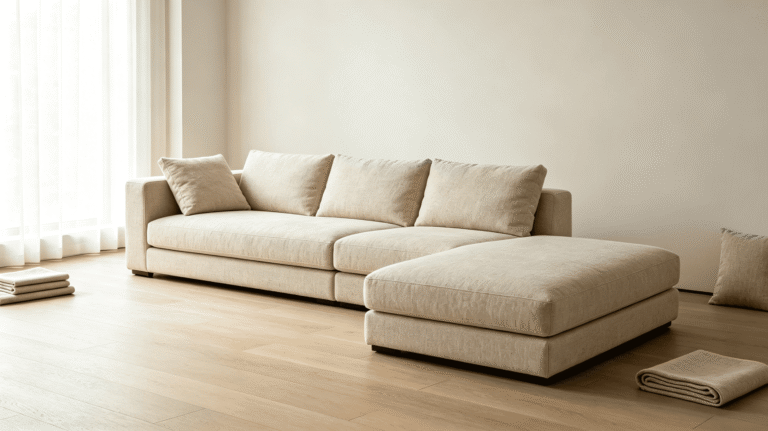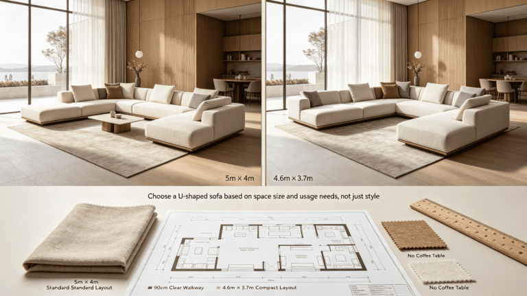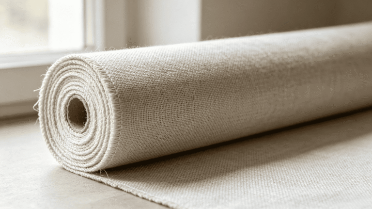
Most designers receive swatches and hold them up to the light for ten seconds. Then they approve the order. That habit causes expensive mistakes on custom upholstery projects.
A fabric swatch is a decision instrument. Used correctly, it tells you the real color under your project's lighting, how the fabric will drape on a specific furniture form, and whether the hand feel matches the application—none of which a photo or spec sheet can tell you.
I've worked with interior designers across the US and Europe for thirteen years from the production side of a linen upholstery factory. I've seen the same mistake repeat itself: a designer skips a proper swatch review, approves based on a screen image, and the finished sofa arrives looking nothing like the moodboard. The factory didn't make an error. The digital preview did. This guide covers how to use physical swatches correctly when you're specifying linen upholstery—sofa, armchair, bed, or dining chair—before committing to a made-to-order custom piece.
Why Does a Photo Always Lie About Linen?
You've probably approved a fabric from a product photo before and felt confident. Then the piece arrived and the color read completely differently in the room. That's not bad luck. It's a structural problem with how linen photographs.
Screen color rendering, photography lighting, and image compression all distort the way linen looks.1 Natural linen reflects ambient light differently depending on the weave direction and fiber density.2 A photo captures one fixed light angle. A physical swatch shows you how the fabric behaves under your actual project lighting.
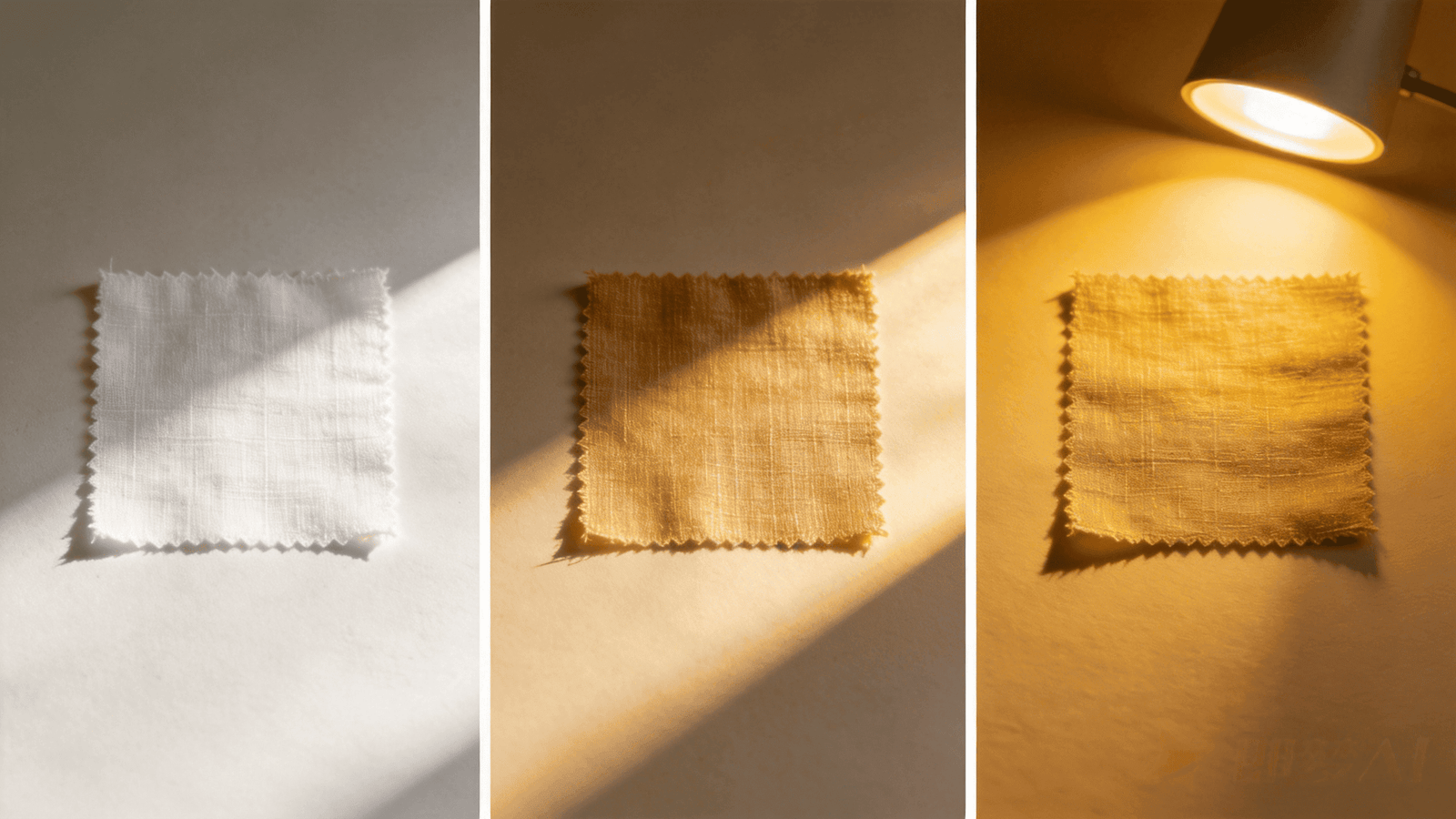
This is something we explain regularly to designers who are selecting fabric for high-end residential commissions. The screen version of a linen color can look warm and sandy. Under the cool north light of a living room with large windows, that same fabric reads almost grey-white in person. Neither the photo nor the factory description is wrong. The screen simply cannot show you what happens when natural fiber interacts with your specific lighting environment.
Here's the core issue: linen has a texture that catches and scatters light. That texture is part of why clients love it. It's also exactly what makes linen impossible to represent accurately in a flat image. The visual character of a Belgium pure linen weave—the slight irregularity of the fiber, the way the surface shifts from matte to slightly lustrous as you move around it—only becomes visible when you hold the physical swatch in your hand, in the room.
What to do instead
| Step | Action | Why it matters |
|---|---|---|
| 1 | Take the swatch to the actual project space | Room lighting changes color perception more than any other factor |
| 2 | Hold it next to your primary finishes (stone, paint, wood) | Linen color reads relative to surrounding materials |
| 3 | View it at multiple times of day | Morning and afternoon light can make the same fabric look like two different selections |
| 4 | Check it under the room's artificial lighting | Evening light is often when clients use the space most |
Digital tools and finish boards are useful for early-stage moodboarding.3 But for a fabric that will be cut, sewn, and upholstered onto a made-to-order piece with no return option, evaluating physical fabric swatches on-site under actual project lighting is the gold standard to avoid costly color mismatch risks for high-value permanent custom upholstery pieces.
Is Batch-to-Batch Color Variation a Defect or a Material Property?
This question comes up often, especially from designers who are placing their first order with a natural fiber factory. They receive a swatch, approve the color, and then ask for a guarantee that the finished piece will match exactly. The honest answer is more nuanced than a yes or no.
Minor batch-to-batch color shifts are an inherent trait of all undyed and naturally dyed cellulosic textiles including pure Belgian linen, rather than a manufacturing defect. Minor differences between dye batches are inherent to how natural fibers absorb color.4 The right question isn't whether variation exists—it's how to manage it before your order goes into production.
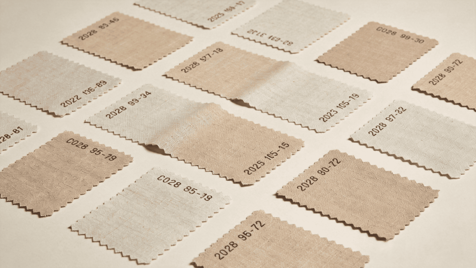
I've had this conversation with designers many times. The first instinct, when you notice that two linen samples look slightly different, is to flag it as a quality problem. In a synthetic fabric context, that instinct is correct. In natural linen, it reflects the fiber's character. The plant origin, the retting process, and the dye absorption rate all introduce small color shifts between production runs. This is why linen has the visual depth that synthetic alternatives can't replicate—but it also means your swatch and your finished order need to come from the same dye lot.
How to manage dye lot risk in a custom order
Before you approve production:
- Ask the factory explicitly whether your order will be cut from the same dye lot as the swatch you approved
- If the project spans multiple pieces (for example, a sofa and two armchairs), confirm that all pieces will use fabric from a single consistent lot
- If the project will be completed in phases, understand upfront that a reorder six months later may not match the original run exactly
When you receive swatches:
- Compare two or three swatches from the same color reference to see whether the factory's current stock is consistent
- If you're specifying for a large-scale project, request a larger cutting so you can assess the fabric across more surface area
| Scenario | Risk level | Recommended action |
|---|---|---|
| Single sofa, one-time order | Low | Confirm same dye lot as swatch |
| Sofa + 2 armchairs, same order | Medium | Request all pieces from one lot, confirmed in writing |
| Phased project, reorder expected | High | Order all fabric upfront if possible; reorders carry variation risk |
| COM fabric (client-supplied) | Variable | Factory cannot control lot consistency; client manages this |
We're transparent about this with every designer we work with. Natural variation is not something to hide or apologize for.5 It's something to plan around. A designer who understands this before production starts will have a better client conversation than one who discovers it after delivery.
How Should You Actually Test a Swatch Before You Approve It?
Most designers look at swatches. Fewer designers test them. Looking answers the color question. Testing answers whether the fabric is right for the specific upholstery application you're specifying it for.
The correct evaluation sequence is: color check under project lighting, drape test by holding the fabric vertically, hand feel assessment relative to the furniture type, and a basic stretch-resistance check for tight upholstery forms. Each step answers a different question that photos cannot.
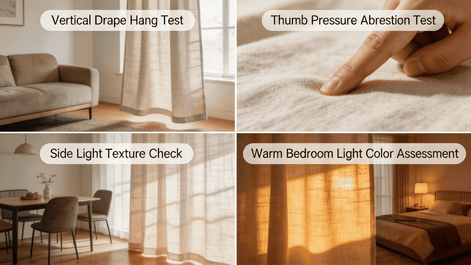
In our experience working with designers on custom projects, the most common oversight is the drape test. A designer lays the swatch flat on a table, checks the color, and moves on. But linen on a flat surface tells you almost nothing about how it will behave when it wraps around a curved sofa back or a fully upholstered armchair. Hold the swatch up. Let it hang from your hand. The way it falls tells you how it will behave on the piece.
Swatch testing by furniture application
Different furniture types have different structural demands on the fabric. A testing approach that works for a relaxed sofa won't give you the right information for a tight-set dining chair.
Upholstered sofa: Hold the swatch and assess how it drapes. A softer, more fluid hand feel generally performs well here—it conforms to the cushion forms and recovers well with regular use.6 Stiffer weaves can look slightly pulled or structured in a way that may not suit a relaxed living room piece. In our experience, medium-weight linens with a slight natural softness tend to work well for sofa upholstery.
Linen armchair: Similar to a sofa but often with tighter lines and more visible seam work. Check the swatch under strong directional light to see whether the texture will read clearly on flat panel sections. Armchairs with structured arms need a fabric that holds its shape under contact.
Linen bed (headboard or full upholstery): Beds are typically seen at close range, often in softer bedroom lighting.7 The texture and color depth of the linen matters more here than stretch resistance. A swatch assessment in dim, warm light is especially important for bed applications.
Linen dining chairs: Dining chairs take the most direct contact stress—sitting pressure, friction from movement, and regular surface cleaning.8 A heavier, tighter weave generally performs better here. When testing the swatch, apply light pressure with your thumb and observe whether the weave compresses or holds. A fabric that flattens easily under moderate pressure may show wear patterns more quickly on a dining seat.
| Application | Key swatch test | What to look for |
|---|---|---|
| Sofa | Drape test (hang vertically) | Fluid movement, no stiffness in the hang |
| Armchair | Flat panel light test | Texture holds under directional light |
| Bed | Warm light color check | Color depth reads correctly in soft light |
| Dining chair | Pressure resistance test | Weave holds structure under thumb pressure |
Running through this sequence adds maybe fifteen minutes to your swatch review. That fifteen minutes is what prevents a costly specification error on a piece that cannot be remade without a full reorder.
How Do You Request the Right Swatches Without Wasting Lead Time?
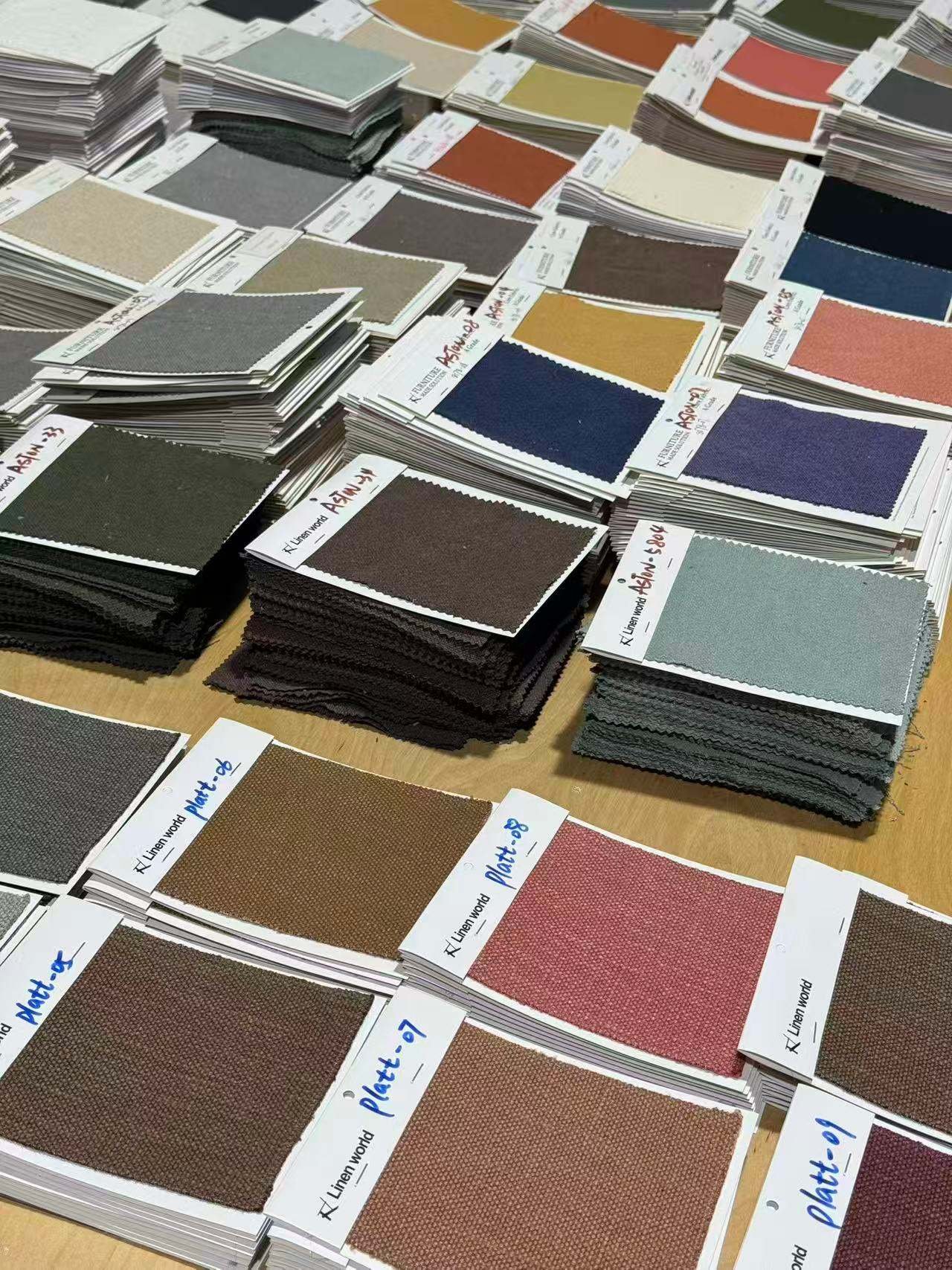
With 200 or more color options available for a made-to-order linen program, requesting swatches without a clear filter is one of the easiest ways to slow down your own project timeline. Too many options creates decision paralysis, not confidence.
The most efficient general workflow to speed up fabric selection is filtering swatch requests by tone range, furniture usage and space palette before submission; direct single-swatch requests remain faster when your target shade is already confirmed. A factory that understands your mood direction can pre-filter swatch recommendations and send a focused set rather than an overwhelming one.9
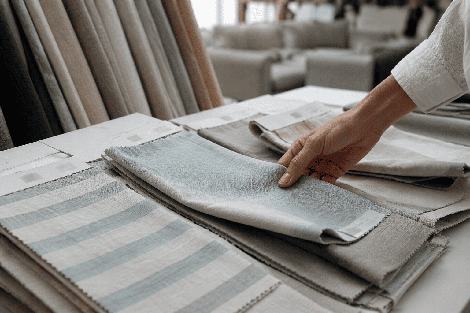
This is something I've found makes a significant difference in how quickly designers reach a confident decision. When a designer sends us a project moodboard or describes the palette—"warm whites and natural stone tones for a California coastal project" or "deep, muted blues for a moody study"—we can pull a focused set of five to eight relevant swatches instead of sending a general sample pack. The designer spends less time sorting and more time evaluating the right candidates.
How to structure your swatch request
What to share with the factory:
- Tone direction (warm neutrals, cool whites, earthy tones, deeper saturates)
- Application type (sofa, armchair, dining chair, bed)
- Any hard constraints (e.g., must work with a specific stone or paint reference)
- Timeline (this affects which in-stock colors can be committed from a confirmed dye lot)
What to ask the factory:
- Which swatches in this tone range are currently in-stock versus made-to-order?
- For made-to-order colors, what is the current dye lot status?
- Can you send two to three swatches in the closest color references so I can compare in context?
| What you provide | What you get back |
|---|---|
| Tone family only | Broad swatch set, slow to narrow |
| Tone family + application | Focused set filtered by fabric weight |
| Tone family + application + palette reference | Pre-filtered recommendation, faster decision |
| Full project moodboard | Curated set with factory input on fit |
We regularly work with designers who are specifying for high-end residential clients on tight timelines. The swatch request process is often where unnecessary time gets lost. A clear brief upfront compresses that stage considerably. It also means the swatches you receive are actually useful rather than decorative.
Conclusion
Use swatches as decision tools. Test them under real conditions, for the right application, from the correct dye lot—and brief your factory clearly before you request them.
If you’re an interior designer sourcing custom Belgian linen upholstery for US high-end residential projects, our 13-year Foshan linen furniture factory provides free targeted physical fabric swatches filtered by your space tone, furniture type and hard finish references. We confirm consistent dye lots for full single orders and share clear batch variation guidance before production. Message us via WhatsApp to request full linen color cards, factory virtual tours or custom sofa quotations.
"Dual-Representation Image Compression at Ultra-Low Bitrates via ...", https://arxiv.org/html/2602.05213. Research on digital imaging confirms that screen rendering, lighting conditions, and image compression can alter the perceived color and texture of materials, particularly those with complex surfaces like linen. Evidence role: mechanism; source type: research. Supports: This source should explain how digital imaging processes like screen rendering, lighting, and compression affect the visual representation of textured materials like linen.. Scope note: The source may focus on general material imaging rather than linen specifically. ↩
"Effect of Weave and Weft Type on Mechanical and Comfort ... - PMC", https://pmc.ncbi.nlm.nih.gov/articles/PMC11012718/. Studies on textile optics indicate that weave direction and fiber density significantly affect how natural fabrics like linen reflect and scatter light. Evidence role: mechanism; source type: paper. Supports: This source should provide evidence on how the structural properties of linen, such as weave direction and fiber density, influence its interaction with light.. Scope note: The findings may apply broadly to natural fibers and not exclusively to linen. ↩
"Best App for Interior Design - Morpholio Board", https://morpholioapps.com/board/. Educational resources on interior design confirm that digital tools and finish boards are commonly used for moodboarding and initial project planning. Evidence role: general_support; source type: education. Supports: This source should discuss the role of digital tools and finish boards in the early stages of interior design planning.. Scope note: The source may not address their limitations compared to physical swatches. ↩
"Advancements in Sustainable Natural Dyes for Textile Applications", https://pmc.ncbi.nlm.nih.gov/articles/PMC10458907/. Educational resources on textile dyeing confirm that natural fibers exhibit batch-to-batch color variation due to differences in fiber structure and dye absorption rates. Evidence role: mechanism; source type: education. Supports: This source should explain the inherent variability in dye absorption for natural fibers like linen, leading to batch-to-batch color differences.. Scope note: The explanation may generalize across natural fibers rather than focusing solely on linen. ↩
"Natural fibers in sustainable materials: extraction ... - PMC - NIH", https://pmc.ncbi.nlm.nih.gov/articles/PMC12926875/. Educational resources on textile production emphasize that natural variation in linen is an inherent characteristic of the material, not a defect. Evidence role: expert_consensus; source type: education. Supports: This source should explain why natural variation in linen is considered a material property rather than a production defect.. Scope note: The source may generalize across natural fibers rather than focusing solely on linen. ↩
"Upholstery Fabric 101: Everything You Need to Know", https://www.fabricmill.com/blog/post/upholstery-fabric-guide.html?srsltid=AfmBOorHgoj2jyEMenNobkNxkJFsaOlz7PO3BU88PYOp-0TJeCNfU3FS. Research on upholstery fabrics suggests that softer, more fluid materials perform well for sofas due to their ability to conform to cushion shapes and recover after use. Evidence role: general_support; source type: research. Supports: This source should discuss why softer, more fluid fabrics are suitable for sofa upholstery, focusing on their conforming and recovery properties.. Scope note: The source may not focus exclusively on linen fabrics. ↩
"The Designers' Guide to Bedroom Lighting - Flower Magazine", https://flowermag.com/bedroom-lighting-basics-and-ideas/. Educational resources on residential lighting design confirm that bedrooms are often lit with softer, warmer light, and furniture like beds is viewed at close range. Evidence role: general_support; source type: education. Supports: This source should provide information on common lighting conditions and viewing distances in bedroom settings.. Scope note: The source may not specifically address linen or fabric considerations. ↩
"How To Choose the Right Upholstery Fabric for Your Dining Room ...", https://www.sunbrella.com/blog/how-to-choose-the-right-upholstery-fabric-for-your-dining-room-chairs?srsltid=AfmBOoos63tW7Q8g60bnGh4H5H3vvpyfsbMuO6cqtm7aWc8GlJzc9e9A. Research on furniture durability indicates that dining chairs are subject to high contact stress from sitting pressure, movement, and cleaning routines. Evidence role: mechanism; source type: research. Supports: This source should explain the types of stress that dining chair upholstery typically endures and how materials respond.. Scope note: The findings may apply broadly to upholstered furniture, not exclusively linen. ↩
"[PDF] 3DESIGN & MFG. Product Design Collaboration", http://mba.tuck.dartmouth.edu/digital/Research/ExecutivePublications/ProductDesignCollaboration.pdf. Industry reports indicate that fabric suppliers often assist designers by pre-filtering swatches based on project moodboards or tone directions. Evidence role: general_support; source type: institution. Supports: This source should describe how fabric suppliers or factories collaborate with designers to streamline swatch selection based on project mood direction.. Scope note: The source may not provide specific examples of linen factories. ↩